Best Bedroom Colors for Sleep: How to Choose the Perfect Shade
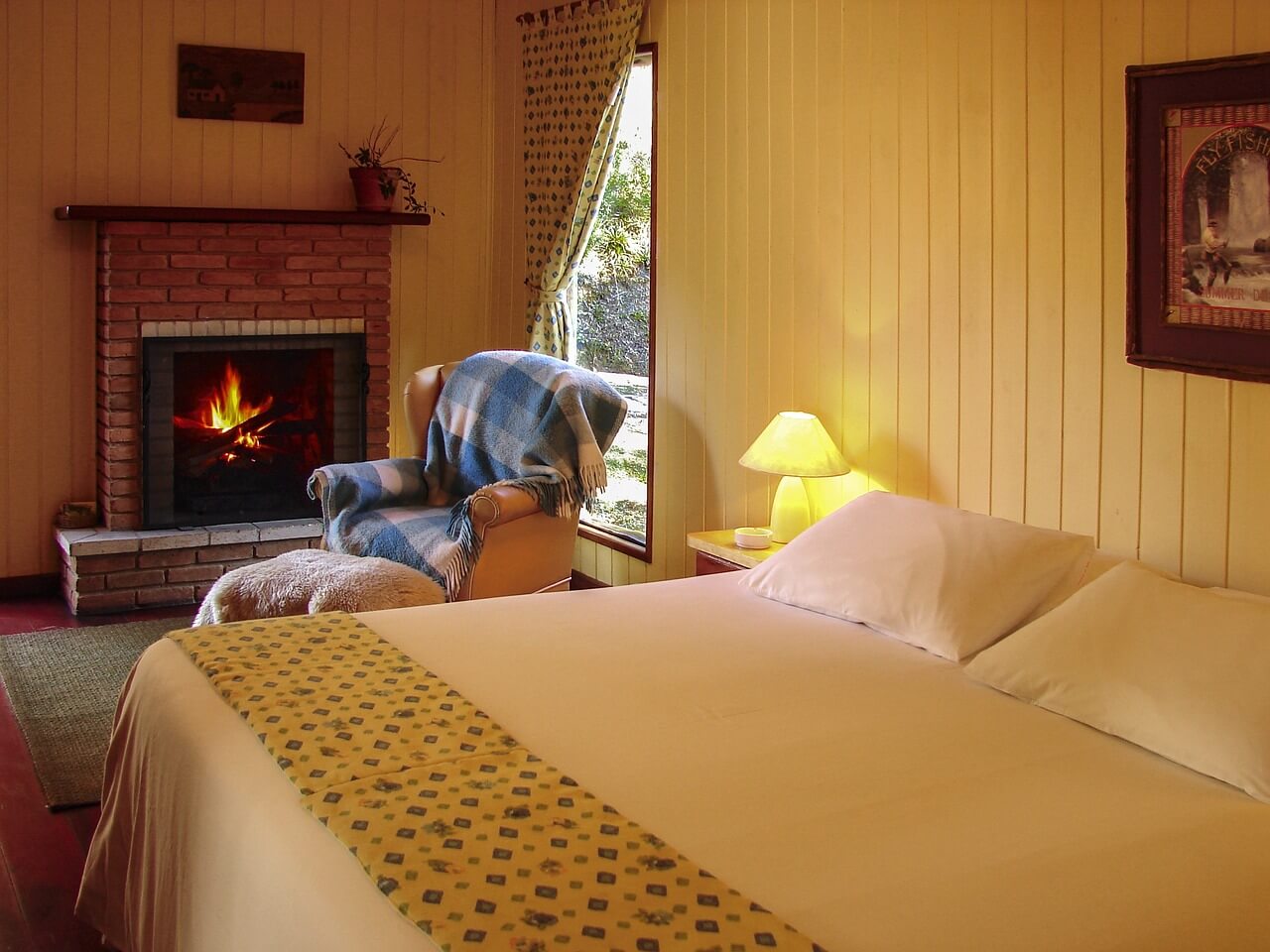
Your bedroom’s color palette influences far more than its aesthetic appeal—it actively shapes your sleep experience. Research indicates that specific hues can lower stress levels, reduce heart rate, and foster the tranquility essential for quality rest. Conversely, poorly selected shades can disrupt your ability to wind down and achieve deep sleep.
This comprehensive guide examines the science behind color selection for sleep environments, reveals the most effective options, and provides practical implementation strategies for your personal sanctuary.
The Neurological Impact of Color on Sleep
The connection between visual perception and neurological response creates powerful associations between color and physiological states:
- Cooler, subdued hues trigger parasympathetic nervous system responses, preparing the body for rest
- Vibrant, warm tones activate the sympathetic nervous system, heightening alertness and energy
- Nature-aligned and neutral palettes consistently demonstrate positive correlations with sleep duration and quality in clinical settings
Let’s explore which specific colors can transform your bedroom into an optimal sleep environment.
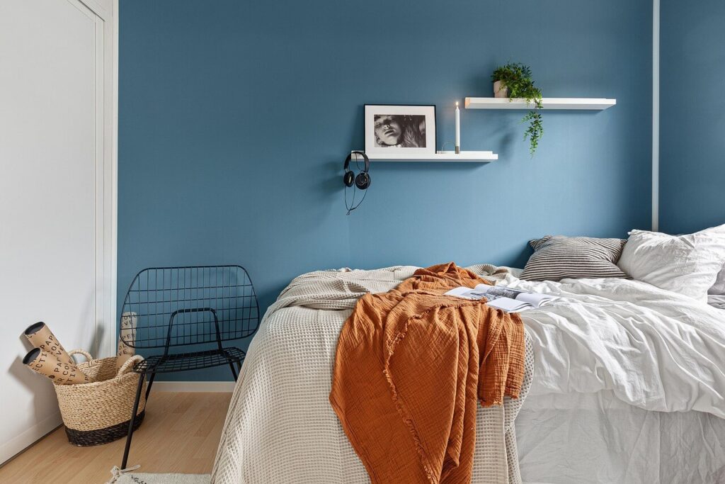
Superior Color Selections for Sleep Enhancement
1. Shades of Blue: The Premier Sleep Facilitator
Blue consistently ranks as the most effective sleep-inducing hue across multiple studies. This color evokes sensations of tranquility, security, and mental decompression—all conducive to extended, uninterrupted sleep cycles.
Implementation Strategies:
- Select gentle variations like cerulean, periwinkle, or pale azure
- Create contrast with ivory or silver-gray furnishings
- Avoid navy or midnight blues, which can create psychological heaviness
2. Verdant Tones: Natural Restoration
Green hues introduce elements of the natural world into your sleep space, promoting equilibrium and stress reduction. Subtle greens like moss, celadon, or muted jade foster harmony between mind and environment.
Implementation Strategies:
- Incorporate soft, earthy green variations for an organic atmosphere
- Complement with natural wood elements to enhance biophilic connections
- Steer clear of vivid or fluorescent green variations that stimulate rather than calm
3. Subtle Neutrals: Versatile Tranquility
Understated neutral palettes—ranging from soft ecru to gentle taupe and whisper-gray—create environments that allow the mind to decompress. These versatile options complement nearly any design aesthetic while maintaining visual serenity.
Implementation Strategies:
- Create depth through layered neutral variations in bedding, walls, and textiles
- Incorporate textural elements through woven fabrics, plush surfaces, and natural fibers
- Avoid slate or charcoal variations that absorb light and create psychological heaviness
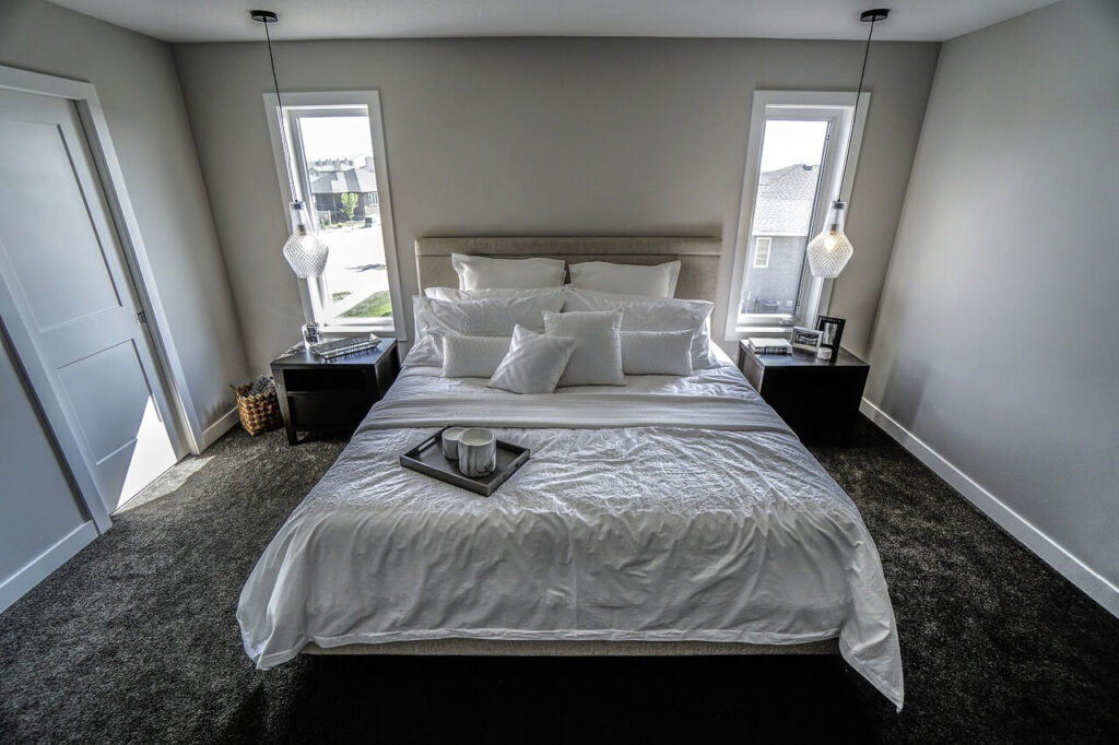
Counterproductive Color Selections
1. Crimson and Amber Hues: Physiological Activators
Red and orange palettes trigger physiological activation—increasing blood pressure, heart rate, and mental alertness. These responses directly counteract the body’s natural transition toward sleep.
Reasoning:
- These shades elevate cardiovascular activity and neurological engagement
- They disrupt melatonin production and circadian rhythm alignment
- For those drawn to warmer palettes, consider muted terracotta or soft coral as alternatives
2. High-Intensity Chromatics: Mental Stimulation
Electric yellows, fuchsias, and lime greens create visual intensity that maintains cognitive activation—precisely the opposite of what supports sleep initiation.
Reasoning:
- These colors maintain cortical arousal and cognitive processing
- They create visual dominance that prevents mental quieting
- If you appreciate vivid colors, incorporate them through small decorative elements rather than dominant features
3. Deep Saturated Tones: Psychological Compression
Intensely dark colors like espresso, onyx, and deep violet can create sensations of confinement and psychological weight that interfere with pre-sleep relaxation.
Reasoning:
- They reduce perceived spatial dimensions, potentially triggering claustrophobic responses
- They diminish light reflection, reducing environmental brightness
- If deeper tones appeal to you, integrate them through selective furnishings rather than wall treatments
Integrating Color Psychology into Comprehensive Bedroom Design
Creating the ideal sleep environment extends beyond wall color to encompass the room’s complete visual composition:
- Strategic accent incorporation: Reserve more stimulating colors for removable elements like throw pillows, art pieces, or decorative objects
- Color harmony principles: Develop a limited palette of 2-3 compatible colors to maintain visual coherence without overwhelming the senses
- Material diversity: Enhance the psychological impact of color through varied textures that add depth without introducing new hues
By thoughtfully applying color psychology principles to your bedroom design, you can create an environment that not only reflects your personal style but actively supports your physiological transition to restful sleep. These intentional design choices transform your bedroom from a mere resting place into a sanctuary engineered for optimal sleep quality.
Latest Posts
How to Make Homemade Disinfectant Wipes
Truth be told—sanitizing wipes have transformed into a modern household necessity. However,...
3 Mins readThe Best Way to Store Fruits and Vegetables to Keep Them Fresh Longer
Food preservation isn’t just a skill—it’s a strategic mission to rescue your...
1 Mins readHow to Keep Your Patio Furniture Looking New
Outdoor furniture isn’t just decor—it’s an investment in your personal retreat. Every...
1 Mins readHow to Choose the Best Area Rug for Your Home
Imagine a single element that can instantly reshape your living environment—welcome to...
1 Mins read


